Font Pairing Guide | Line Spacing: 5 Quick Tips When Using Sweeping Fonts
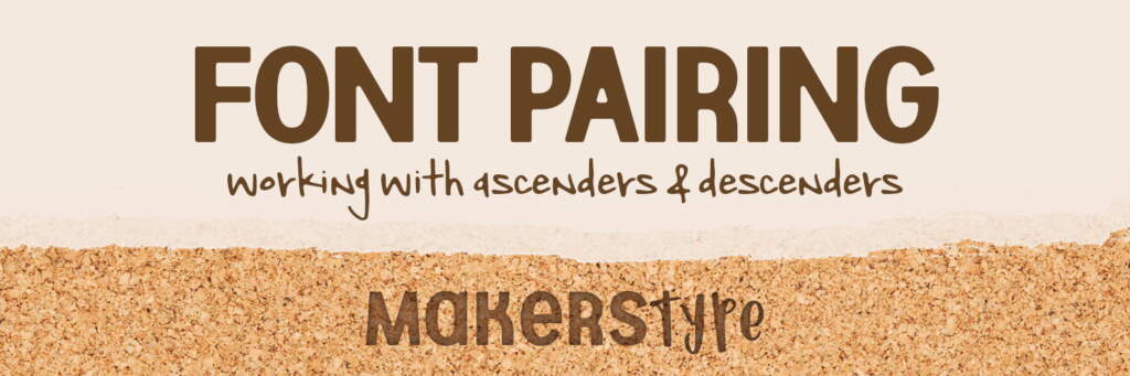
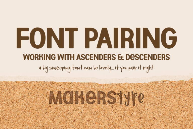
Working with Ascenders and Descenders
This font pairing guide looks to help everyone focus on the space above and below the fonts, known as “line spacing”. We will for sure go over line spacing a few times, so this one is just focused on paying attention to a font’s ascenders & descenders. Specifically we are talking about “sweeping fonts” which we are defining as typefaces with dramatic variations in the highs and lows of characters.
What are Ascenders and Descenders?
It seems obvious once you are aware, but ascenders are the parts of the letters that extend up and descenders are the parts that extend down. More technically, ascenders are anything above the “x” height and descenders are anything below “baseline” height. Here are some examples below from FontLab.


How to Correctly Use Sweeping Fonts
On certain projects, fonts with large ascenders and descenders can add a very natural feel to your typography. On the other hand, when used incorrectly these fonts can make your project look unprofessional. So, as always, it’s important to determine what feeling you are going for in your project before you pick out the design elements.
Line Spacing Tips: Sweeping Fonts
Here are some tips on how to pair fonts that have large and sweeping ascenders and descenders.
1. Stay away from using sweeping fonts for large sections of text. Instead, save them for headlines and accent words.
2. Does one of your lines have no ascenders or descenders? Pair that font against a unicase or allcaps font.
3. You may be able to offset one line to give enough space for an ascender/descender. This can also help the typography feel more balanced even if it’s not.
4. Overlapping letters isn’t always a bad thing, sometimes it may even be preferred. When doing this, it can be helpful to use two different colors so each letter is easily differentiated.
5. It can also be helpful to keep the typography on a single line to get rid of any issues from large sweeping fonts.
Conclusion
Sweeping fonts can bring lots of personality to your designs, especially when you keep some of these tips in mind. We would love for you to share with us how you have used sweeping fonts on our social media pages.
Do you have any design tips or topics you would like us to cover? Let us know in the comments.

Fonts Used: Beautiful Things, Raspberry Moonshine, Wildemount, Market Fresh, Avocado and Lime, Meatloaf, Shorthalt, Aberforth, Love Monster, Moonbright.