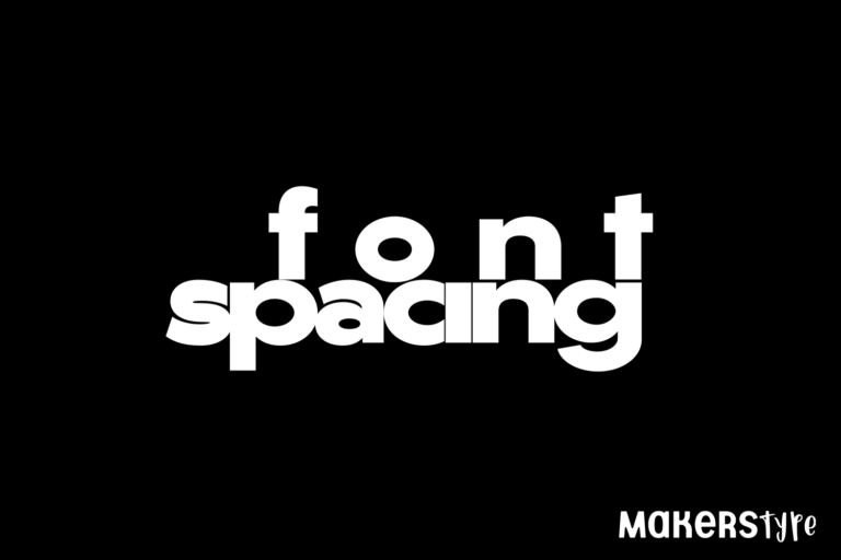
Font Tips | Font Spacing: A Quick and Easy Guide
What is spacing in typography?
Over and over we see new designers struggle with Font Spacing. It’s common for someone to invest time in finding just the right font, but once they do, not spend enough time tailoring that font to their design. Understanding all the options available in highly functional fonts will take your typography to the next level. However, the first adjustment can be done with any ttf or otf font available. Adjusting text spacing in a project takes little time and can make a drastic impact on the readability and feel of the words in your project.
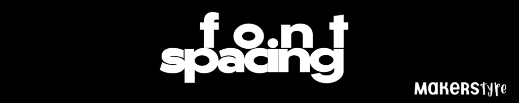
Font Spacing (or tracking) adjusts the space in between individual letters in your text. Design is always an art rather than a science, but learning some simple rules can help your design become more legible, attractive, and bring your typography to the next level.
Kerning vs Letter / Font Spacing
Kerning is the space between individual letters or characters in a font. This is a time-consuming meticulous art form font designers go through, that if done well, no one will ever notice. The goal is to make the font feel flowing and natural and adjust the spaces between each character to achieve that. For the purpose of this discussion, we are going to split hairs and talk mostly about the space between letters in a project, which we will call Letter or Font Spacing, and not in the font overall. Many would argue they are the same thing, and that is totally fine, but we go through the process of Kerning on a font design article.
In this article, we are trying to help designers learn the tools available in photoshop and other digital editors to master what is commonly known as tracking or font spacing.
As an example, we will be using Gonzi Black (used on the word ziggurat below) by Måns Grebäck, to help show how adjusting the spacing changes the feeling the typeface gives off. The original spacing looks very natural, and as always, Mans has created a clean font that can be used in so many different ways.
Notice how the spacing between the capital “R” and “A” is nonexistent while most of the other combinations are only tightly spaced? This is the artform of kerning, and it shows just how difficult it can be. If the same space is given for the R – A combination as for most of the other letters, it would feel more spaced out and less natural. The average user won’t notice this because the combination is set to maximize readability.

Font Tips | Font Spacing: A Quick and Easy Guide 1
But for this tutorial, our top goal is not legibility, but style. So let’s look at what happens when we adjust the font spacing.
How do you space a font?
Tracking, or Font Spacing, adjusts the overall spacing between letters in a word, phrase, or paragraph. This term will be pretty universal for most tools/software, but we will be showing examples from Photoshop. The symbol will most of the time look something like this:
![]()
There is no right answer on what the tracking should be, but adjusting it can drastically change how the typography presents itself.
Decrease / Narrow Spacing
But now let’s adjust the Tracking by hovering the mouse next to the tracking symbol, and when the cursor changes to a hand with arrows pointing in either direction, we will click and hold while dragging the mouse to the left, causing the letters to get closer together. See examples below.


And we end up with something like this. The feel of it has now completely changed. The font still carries the same modern expressive capitals and clean typeset, still very legible, but now has a more aggressive feel. If the original text was a logo, I would say it represents a clean and organized group, where this now represents maybe a company that moves fast and gets things done. You may differ in your opinion of the feeling, and that’s ok, the important thing is to see how just adjusting the spacing created a different look and mood.

Increase / Widen Spacing
We can also drag the font the opposite way to create more space between each letter. Again, hover over the tracking symbol, click, and hold down while dragging right.

This example is a bit more extreme than often used, but it may be my favorite. I could see this style being used to give a dramatic feeling in an advertisement. We use this all the time to give the text a bit more symmetry in a design where two words need to be paired but are very different lengths.
How can this make my designs better?
Here is a silly example to give an idea of how it can help in your projects. By increasing the tracking on the short word while decreasing the tracking on the longer word, it gives a new aesthetic that may improve your design. They are not the same width, and they do not need to be, but this helps get rid of some of the empty space if that is what your design needs. In this example, it didn’t drastically improve the design, and sometimes your might find that to be true. Other times, it can revolutionize it and allow you to either fit more text on a line or even give balance in a design where it is needed.

Conclusion
Choosing the right font is sometimes only be half the battle in perfecting your designs. Using Font Spacing on top of this can be a simple and effective way to take it to the next level.
Looking for more design tips? Check out more design articles here.
Notes
This article uses:
Måns Grebäck’s typeface Gonzi Black for the “Ziggurat” and “font spacing” font.
BMD’s Suger and Spice Handsans for the “Cute Capybaras” Font.
The capybara is also drawn by Brittney.