Types of Fonts | A Complete Guide to MakersType Font Classifications
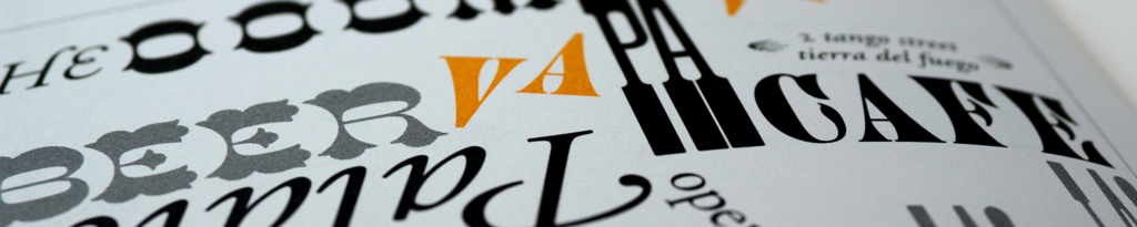
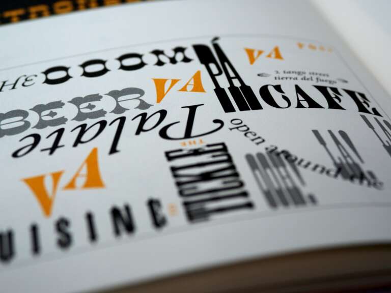
How many types of fonts are there?
With so many types of fonts, it gets difficult to sort through everything and find what you are looking for. This is MakersType’s guide to how we classify fonts. Our way isn’t necessarily what you will find in textbooks, but this is the system we have worked out to help you narrow down the wide variety of fonts available, into something more manageable and easy to sift through.
Our goal was to set up two types of classifications which we broke down into Categories and Filters. For the Categories, fonts (in theory) should just belong to one of these and not another. (With art, the lines are blurred sometimes, but it works for the most part). A Script is never a serif and a symbol/dingbat font is never a sans. If you know you want a script for your next project or you are only looking for symbol fonts, these are the boxes to use.
The other classification we call Filters. You can click as many boxes as you would like here to narrow down the type of font you are looking for. If you need a font that includes bold, brush font, click all of those options in the Technique and Style section and the results will populate accordingly.
Table of Contents
-
Font Categories
Serif | Sans Serif | Script | Symbol or Dingbat | Aesthetic
Font Filters Guide
Technique
Brush | Chalk | Distressed | Handwriting | Sketch
Style
Bold | Light | Thicc | Narrow | Wide | Italic | Inline | Outline | College | Embossed
Characteristic
3D | Curly | Stencil | Bouncy | Dotted | Framed
Genre
Farmhouse | Vintage | Western | Tattoo
Seasonal
Spring | Summer | Fall | Winter | Christmas | Valentines | St. Patricks | Religious | Patriotic
Feeling
Casual | Formal | Feminine | Masculine | Kids | Cute | Whimsical | Horror | Quirky | Happy | Happy | Sad | Industrial | Elegant
Font Categories
Serif Fonts
Serif fonts have tails or feet, which are small strokes that help distinguish each character and add a unique look to the font. More often than not, serifs are seen as easier to read in printed material.
Subcategories of Serifs
Traditional
Traditional or classic serifs tend to be clean glyphs with obvious tails. These generally look like the stereotypical design when a designer thinks of a serif font.
Sans Serif Fonts
Sans-Serif fonts, like the name implies, do not have tails or feet.
Subcategories of Sans
Traditional Sans Serif Fonts
Traditional Sans are clean typefaces with no flags or tails.
Script Fonts
We define a script as a font where many of the characters and glyphs connect to each other or have a fluid stroke.
Subcategories for Scripts
Calligraphy Fonts
Very difficult to capture digitally, Calligraphy fonts simulate the art of broad tipped lettering.
Similar Pages: Stylish Fonts
Symbol Fonts
Also called Dingbats, Symbol fonts don’t really use traditional characters. They use pictures in place of each glyph for easy vector clip art.
Subcategories of Symbol Fonts
We split these up into categories to help them be a bit easier to search through.
Animal Fonts
Dingbats that feature animals can be found in this category. As of all Symbol fonts, these vector images should work well with any cutting machine.
Framed Fonts
If you are looking for a selection of decorative borders to give your next project some flair, these fonts typically have multiple options of a similar style and are an easy way to spruce up your design. If you would like to include letters on top of these borders you will need to layer them on top in something like Photoshop or PowerPoint. If you would like something with letters already included check out the “Framed” section.
Icon Fonts
Icon dingbats can help your design look unique and fresh by giving commonly used symbols (arrows, socials, actions, etc…) a fresh look that might be more in line with your project. These can help your workflow by speeding it up, especially if you need to include them alongside the text.
Nature Fonts
Find images of flowers, trees, fruits, scenery, and more in this symbol category.
Heart Fonts
Find all the images your heart can take of … hearts. What did you think we were going to put in the heart category?
Cultural Fonts
Dingbats that are associated with a culture, country, or area can be found here. Topical examples would be something like flags and holidays.
Aesthetic Fonts
There are always fonts that don’t fit into the traditional categories because they either have so much character or bend all the rules of each definition. Often these are called display fonts, but that term is falling away because it doesn’t really give you any indications of what it might look like. (You can display any font. 🙂 ) So we chose the word aesthetic because these fonts are really something you want to use if you are looking for something visually unique. Because Aesthetic covers a wide range, we have lots of subcategories that help to break it down more.
Subcategories for Aesthetic
Comic/Cartoon
These fonts evoke a similar feeling to those found in comic books and cartoons
Gothic
Also called blackletter fonts, Gothic fonts tend to have a medieval vibe, often using highly detailed capital letters.
Graffiti
As you might think, these fonts give the feeling of a street artist tagging with a brush or spray can. These fonts have also been known as urban decay fonts.
Typewriter
These simulate the look of text being printed by an old typewriter.
Digital
These are designed to resemble the look of digital text screens. Think old calculator, scoreboard, or alarm clock.
Monogram
While almost any font can be made into a monogram (i.e. decorative initials, like those used to personalize jewelry, drinkware, etc…), these fonts are typically highly embellished in an elaborate, over-the-top style.
Filters Guide
We use filters to help narrow down your search by selecting the styles, feelings, or features that you are interested in. If you are looking for a happy script, you don’t necessarily need to look through all the fonts in the horror or western, so we help you cut those out and save time.
Technique
We use the term technique to help describe the medium or tool used when creating the font.
Brush Fonts
Brush Fonts give a look as if they were made with a paintbrush
Chalk Fonts
A font that looks as if a piece of chalk was used to draw it.
Distressed Fonts
A popular style that gives a feeling of the font beomg weathered or eroded.
Handwriting
Fonts that give the impression that they were handwritten on a piece of paper. These fonts are often made with a pen or stylus on a pad to give a more authentic feeling.
Sketch Fonts
Fonts that look as if someone used a pencil or chalk and sketched the glyphs out on paper or a chalkboard.
Case
The case of a font generally has to do with its overall height. Fonts tagged with these filters will generally have a uniform height, making them a great choice when you need lines of text right against each other without a lot of awkward empty space.
All Caps Fonts
Where both the uppercase and lowercase characters are all versions of capital letters.
Mono Height Fonts
In these fonts, both upper and lowercase letters are roughly the same height.
Style
In this category, fonts include common characteristics that are classically included in typeface definitions. These characteristics include weight (number of pixels wide), spacing, slant, and line strokes, A well-tooled font may include many of these styles all under one title.
Bold
Bold fonts tend to look a bit thicker than the average font. If a font family has multiple weights, the largest one tends to be the Bold version.
Light
Light fonts often are the smallest in a font family, but also can be individual fonts.
Thicc
These uber-bold fonts tend to be proud of their size and are not trying to hide it.
Narrow
Narrow fonts have a much smaller “Advance Width” than most fonts, especially when compared to other fonts in the same family. Overall these fonts look have a narrower width witch can be helpful for including more characters in a single line.
Wide
As you might have guessed, wide fonts have a greater than average “Advance Width” than most fonts, especially when compared to other fonts in the same family. These fonts are great at taking up more empty space on a single line because they are wider over all.
Italic
Italic fonts have a slant to the glyphs to help them stand out when paired with other fonts.
Inline
Fonts that have a line down the middle of each letter are often known as an Inline fonts. This can be either a white space down the middle or the inverse and have a black line on the inside of an outline font.
Outline
Outline fonts often trace around outside of a glyph. They typically only have the outline of a letter surrounding negative space.
College
Typically very blocky and bold, college fonts reminisce of university logos and acronyms. Easily readable from any distance.
Embossed
Like Monogram fonts, Embossed fonts are often over-the-top aesthetic fonts that give the look of being carved or imprinted into something.
Characteristic
Characteristics are a feature or detail that runs throughout each glyph and define the whole font’s overall look.
3D
These typefaces give a look of multi-dimensional depth to their glyphs.
Curly
Many fonts are curly, but these fonts have all kinds of curls.
Stencil
These fonts simulate the look of a stencil being used to create each letter.
Bouncy
These fonts have the ability to use characters in a way that moves the font up and down based on your design needs.
Dotted
These typefaces usually only use dots to create each glyph, giving the look of a “connect the dots” drawing for the letters.
Framed
Most of these fonts are encased in a decorative element of some sort.
Genre
The Genre font category describes typefaces that are designed to fit a particular theme or trope.
Farmhouse
Farmhouse fonts are typefaces that fall into the farm, country, or cottage style.
Vintage
These typefaces have the feeling of being old or having a classic look. Sometimes known as antique fonts.
Western
Western fonts, as they sound, look as if they belong in the wild west. Many have “spurs” (not like cowboy boot spurs) or pointed extensions off of the main stroke.
Tattoo
Tattoo fonts are all about looks. These typefaces normally won’t be great for writing a paragraph but will make a single word or phrase have lots of character and stand out.
Seasonal
Spring
Spring fonts often bring out feelings of brightness and freshness. They also may include small designs or accents that are common to spring, like raindrops or flowers.
Summer
We see summer fonts as typefaces with vibes of being relaxed or outgoing. These tend to work well on advertisements for outdoor events or projects that you would want to give a laid-back feeling to. You might find elements of suns, beach balls, waves, and other design features.
Fall
If you are starting a project where you need fonts with leaves, harvest aspects, or other autumn design elements, you might look in the fall category. We put fonts in this category that give off the feelings of going back to school, cuddling up under a warm blanket, and roasting a marshmallow at a campfire.
Winter
Winter fonts can have elements like snowflakes, stars, and snowmen. We often put fonts here if they give the feeling of new years hope, baking at family get to gather, and sledding down your favorite hill.
Christmas
Christmas fonts are the place where you find typefaces with gifts, candy canes, lights, and many other traditional Christmas decor. Although many of these fonts do have a Christmas theme, they also can be great to use throughout the year because of their classic flowing look.
Valentines
Hearts… all the hearts. A few arrows, possibly even some lips… and did I mention hearts? Many of these typefaces are flowing scripts with sweeping ascenders and descenders. I also have been told they may feature hearts.
Similar Pages: Fonts with Hearts
St. Patricks
We got leprechauns here… the nice kind though, not the scary ones. These fonts may typically have clovers, pots of gold, or have a Celtic feeling.
Religious
Here you can find a variety of religious fonts. If we had a category for each belief system individually the list could go on for a while, so we have included them all here. No real description could cover the vast feelings and nuances in this category, but you might find several typical religious symbols and ancient-looking text.
Patriotic
Patriotic fonts will often have elements of national significance such as flags, country shapes, or official animal symbols for states and countries.
Feeling
Often, designers are looking to evoke a feeling with their projects. If your design could use something that gives it a particular emotion, try this category for suggestions to move your typography in that direction. Mixing two feelings can often give a great contrast for a design. (Example: Matching an Industrial font with a Casual font can evoke the feeling of a serious business that is very friendly)
Casual
Casual fonts typically feel like they are organically made and often don’t use straight edges. These fonts are great for showing a friendly human side to any design.
Formal
Formal fonts often give an upscale or ceremonial feeling. Typically you may see formal fonts on invitations or fine dining menus.
Feminine
Fonts that have a “stereotypically feminine” feeling can be found in this category.
Masculine
This category is for fonts that tend to lean towards the “stereotypically masculine” feeling.
Kids
Each of these fonts has the feeling as if a child wrote them or that work great for projects intended for children.
Cute
Cute fonts evoke a feeling of being adorable or pretty.
Whimsical
Typefaces with the whimsical feeling look as if they may have come from somewhere like Middle Earth or Never Never Land. Each brings its own unique characteristics but may provoke thoughts of your favorite fairytale worlds.
Horror
These typefaces fall in the stereotypical category of classic horror film logos. These are often eroded or sketched, and may not have many straight edges.
Quirky
These fonts often will have imperfect symmetry while still remaining legible. Although not suited for every project, quirky fonts can give a very unique look to your designs and stand out on their own.
Happy
Happy fonts evoke an overall feeling of being bright and cheery.
Sad
As one might think, Sad fonts evoke a sad and blue feeling and are designed to do so.
Industrial
Industrial fonts have a feeling of strength and uniformity. Possibly looking like they are made of metal or with a roughness to them like they have been weathered over time.
Similar Pages: Professional Fonts
Elegant
Carefully designed, Elegant fonts have a classy and sophisticated feeling to the flow of the glyphs. Great for wedding and gala projects.
Features
The Features filter separates out fonts that include additional functionality tucked away in their code. None of these are required for any design, however having multiple features in a font will increase your ability to customize your text and make it less redundant.
Alternates
Fonts with Alternates have OpenType functionality to allow you to change specific characters to alternative versions. Read more about alternates in our OpenType Features post on them.
Ligatures
Fonts with ligatures make use of OpenType features that contain single glyph combination characters for both stylistic and contextual variation. The most popular example is the “tt” ligature, which typically changes one of the t’s so that they either don’t connect, connect stylistically, or look less uniform.
Swashes
A typeface with swashes typically has decorative elements or alternates that can be used at the beginning or end of a word or phrase.
Perks
Perks are extra things that are allowed or that the font is capable of.
Classroom Friendly
These fonts allow use in a classroom by a teacher under their personal use EULAs. They will still need to be licensed to be used in any designs shared or sold by the teachers, just not for use in their own classroom.